top of page
2024
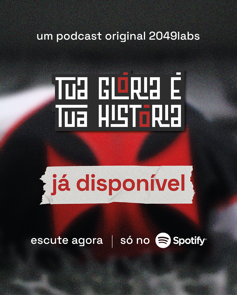
Tua Glória é Tua História
a Vasco da Gama Podcast
My role: End-to-end Creator/Developer * Product: Visual Identity System * Timeline: 4 weeks

Overview
This project was developed for a podcast focused on the history of Clube de Regatas Vasco da Gama.
The goal was to create a visual identity capable of supporting narrative-driven content, highlighting the club’s cultural and historical significance beyond football.
The Project
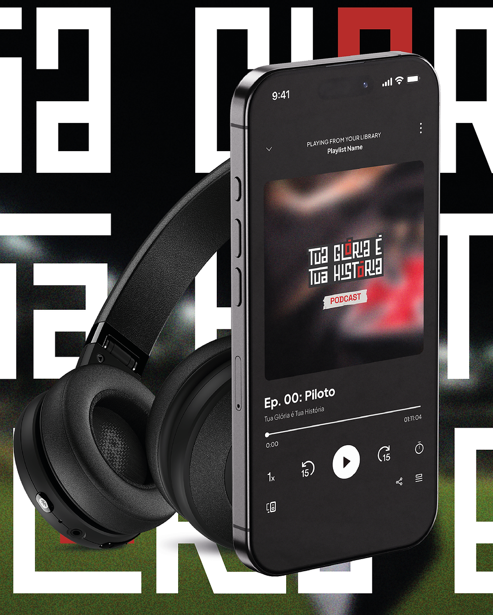
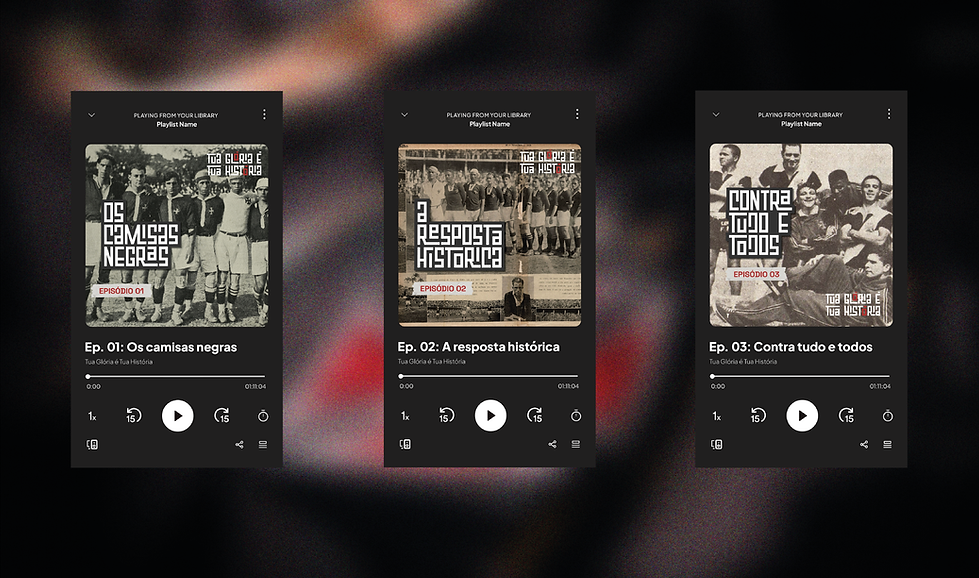
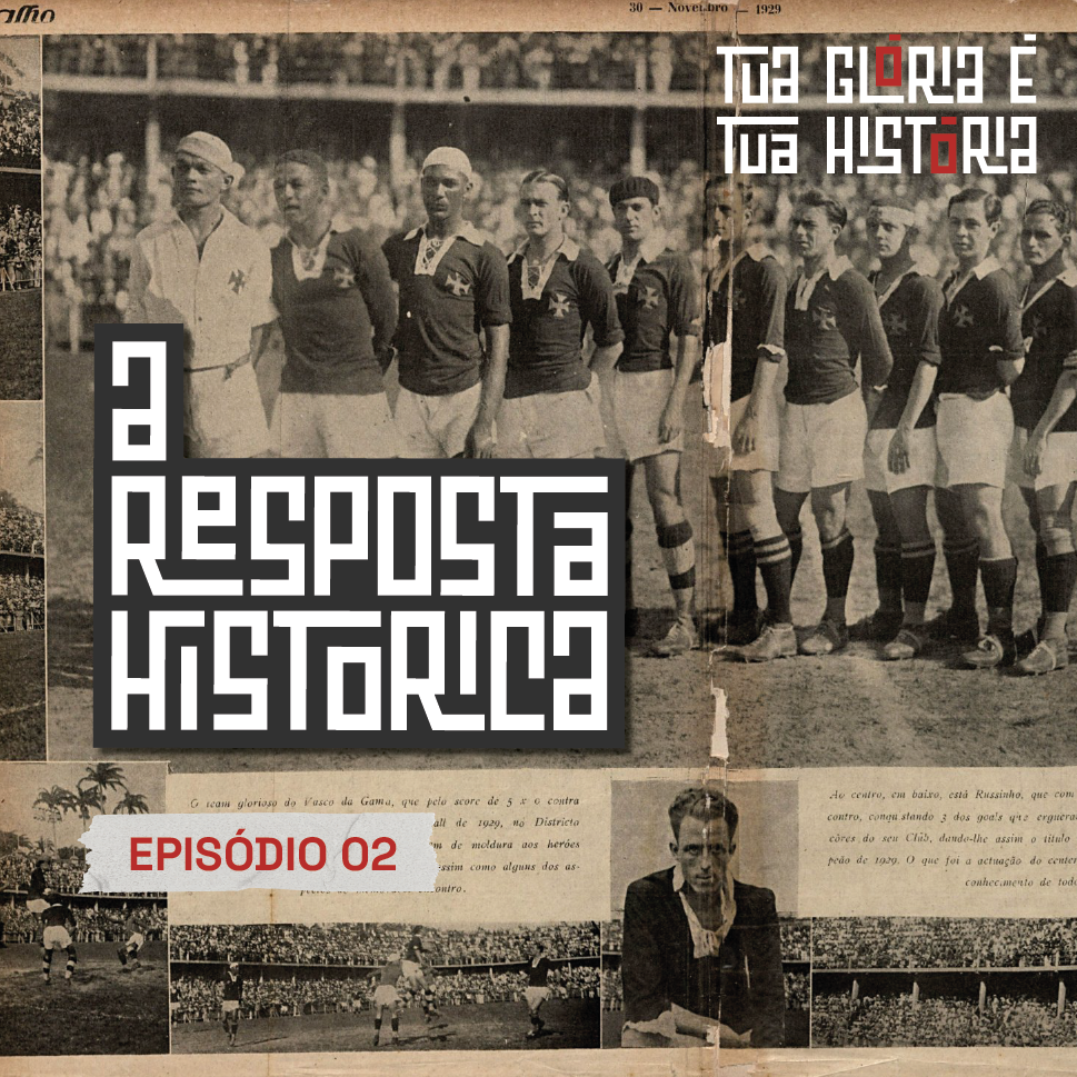
The identity was designed for a podcast exploring key moments in the club’s history.
It needed to be clear, recognizable, and adaptable across digital platforms, including streaming services and social media.

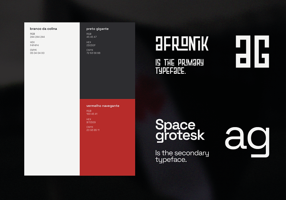
Typography
Afronik was selected as the primary typeface for two main reasons.
Its African-inspired visual language creates a subtle connection to the historical context of the Camisas Negras.
At the same time, its geometric structure aligns with the typographic style commonly found in Vasco’s official materials, reinforcing familiarity and recognition.
Color
The palette is based on Vasco’s traditional black, white, and red.
Rather than expanding the system, the focus was on using these colors with precision — contrast for clarity and red as a point of emphasis.

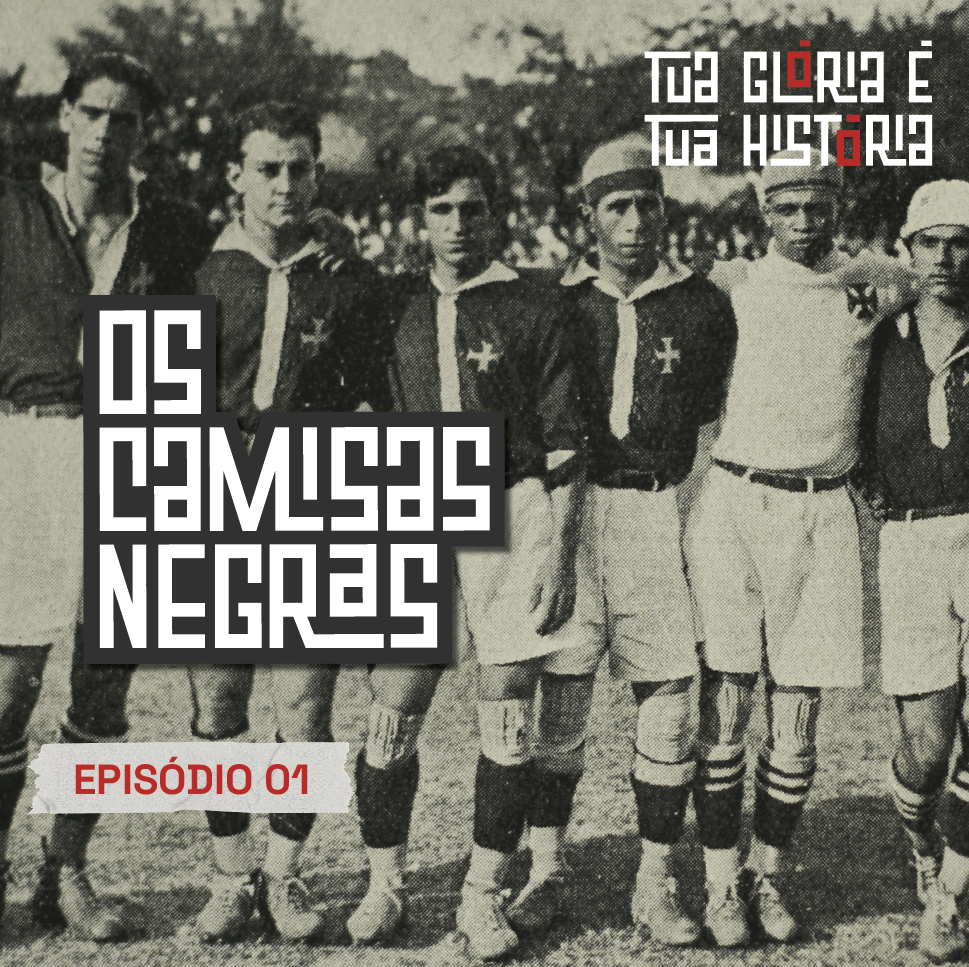
Visual System
The identity is built as a modular typographic system.
Rigid grids, repetition, and strong alignment ensure consistency while allowing flexibility across different formats.
Typography operates as both content and graphic element.
Applications
The system was designed to work across multiple touchpoints:
-
Podcast covers
-
Social media posts
-
Episode highlights
-
Promotional materials
All applications prioritize clarity and strong visual presence at different scales.
Outcome
The project was developed for a real client.
Although the podcast did not continue beyond its initial episodes, the identity was fully designed as a scalable and consistent visual system.
Takeaways
This project focused on translating historical context into a clear visual language.
It reinforced the importance of:
-
Building systems instead of isolated assets
-
Using typography as a primary design tool
-
Balancing concept with clarity


bottom of page